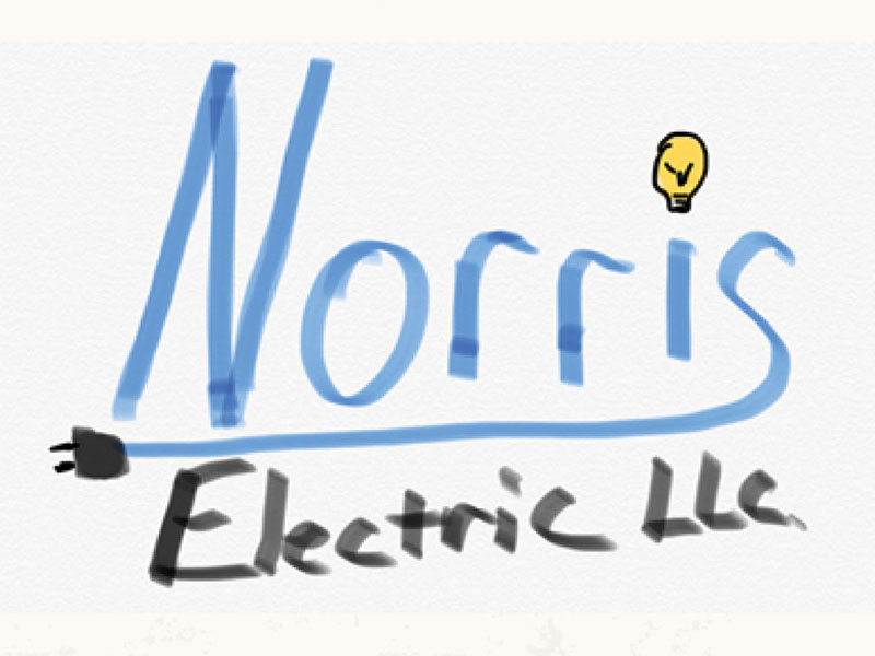
When Jesse Norris took over leadership of Spencer Electric, LLC, he wanted a fresh start to go with the fresh face of the company. The client had specific ideas about the visuals of the logo – and even sent a small drawing to give me something to start with – but trusted in the expertise of a designer to adapt those ideas to reality. Always the mark of a great client!
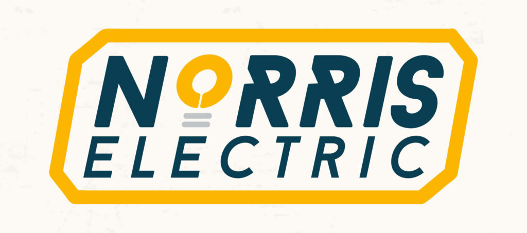
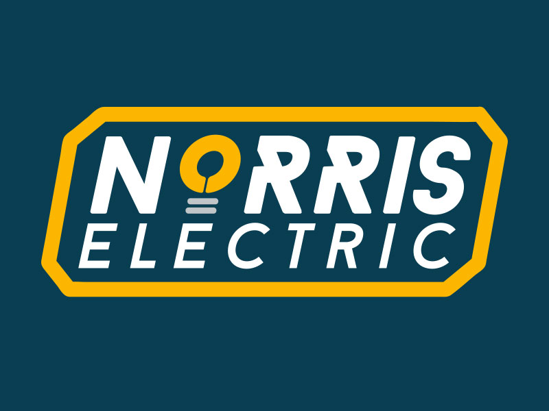
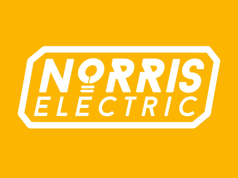
The final logo is a bold and elegant “stamp” of quality expertise, with kinetic and precise typography, that pairs heavy use of “electrical warning” yellow with a unique, rich teal that never fails to catch the eye. The final logo was turned over with deliberate choices for alternate color options that retain the brand’s bold direction while adapting to any necessary use in communications, marketing, or invoicing.